[ad_1]

Netflix began rolling out its first major update to its TV app in ten years, in a bid to make the interface easier to use and allow users to make viewing choices much quicker.
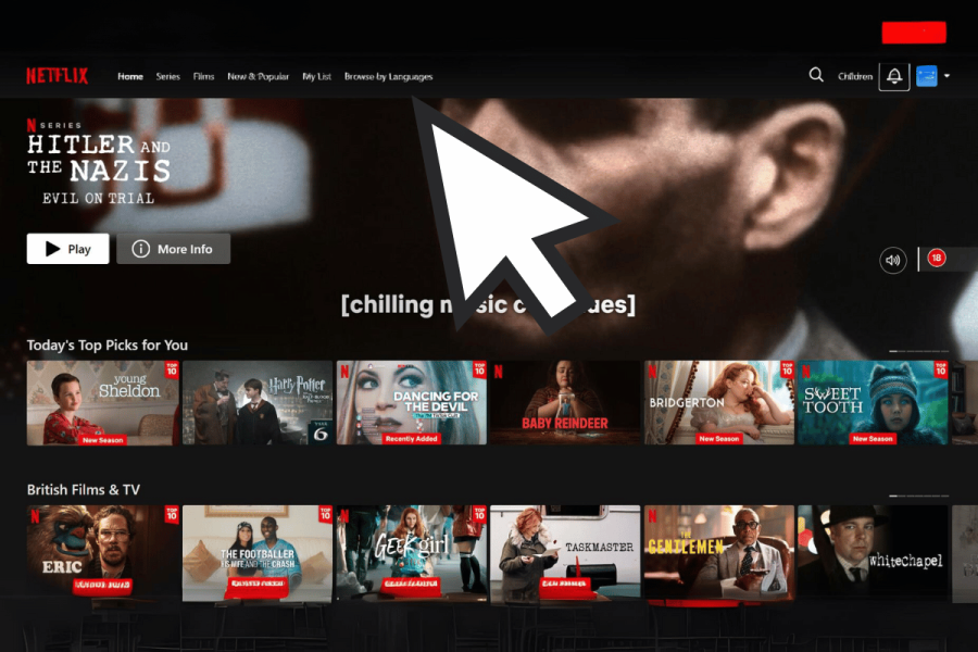
The new interface changes from the previous static tiles, which showed available shows and movies into dynamic boxes that expand when selected with your remote. Netflix’s redesign attempts to prolong viewer engagement on its platform, increase customer retention and attract subscribers to its newly introduced, budget-friendly subscription options that include ads.
However, the new format will initially be available to only a subset of Netflix’s nearly 270 million global users starting Thursday (June 6). The company will gather feedback and may make adjustments before a wider rollout. ReadWrite has had a glimpse of the cleaner interface, as the left-hand menu has disappeared. However, not all users were too happy with the changes.
So Netflix and Apple did a design do-si-do, and I want the TV app to revert. pic.twitter.com/CfeqgKpomC
— Sigmund Judge (@sigjudge) June 6, 2024
Speaking to The Verge, Pat Flemming, Netflix’s senior director of product, said: “We often see members doing gymnastics with their eyes as they’re scanning the home experience.
“We really wanted members to have an easier time figuring out if a title is right for them.”
Reuters also cited Flemming as saying, “Viewers’ eyes were darting around from the row name to today’s top picks, to the box art, to the video, back to the synopsis.”
What changes has Netflix made to the TV app?
The upgrade gets rid of the menu that previously extended from the left side of Netflix’s homepage, introducing a more streamlined array of options at the top of the screen, which include search, home, shows, and movies. Users no longer need to scroll all the way to the top to access the new menu. They will only have to press the back button on a remote. The homepage revamp also includes larger title cards, restructured information, and prominently displayed details like a show or movie’s duration in the top 10 list for eight weeks.
The redesigned menu clears some of the clutter on the old left-side menu, such as the “Categories,” “New & Popular,” and “My List” tabs. However, it introduces My Netflix, a feature that first appeared on its mobile TV app last year, providing personalized recommendations and quick access to recently watched or saved titles. The “Categories” tab is still available through the search option.
Featured image: Netflix / Canva
[ad_2]
Source link


